Showing posts with label Christmas. Show all posts
Lusus

Christmas Paper Cutout Collection For Affinity Designer


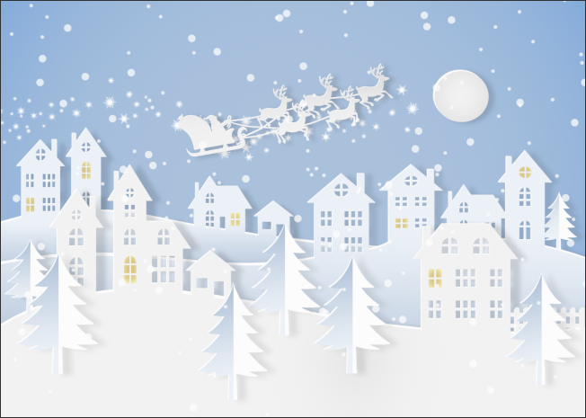
A digital image of santa and reindeer flying over houses. The image is in the style of paper cut out.

 
With Christmas on its way lots of people are thinking about decorations, greeting cards, as well as creating their own online festive themed designs. One popular and ever fashionable form of Christmas decoration is the paper cutout effect, and this collection for Affinity Designer will enable you to quickly and easily create your own designs for either personal or commerical use.
 
Once you've grabbed a copy of these Affinity Desiner Assets, head back here to view the tutorial on creating festive scenes with the collection.
 

What Is Included In The Christmas Paper Cutout Collection

The Christmas paper cutout collection includes many items.


Once the items have been added to Affinity Designer, under the Assets tab there will be a category called Christmas 1. This is divided into a number of subcategories to make finding what you want a little easier. All the subcategories contain either festive themed assets that have a cut out effect or flat items. 
 
The paper cutout items mostly consist of two layers (sometimes more) that have been grouped together. The bottom layer, as well as giving the item a little depth also contains an editable shadow effect. Most assets have both a paper cutout version as well as a flat one.


There are a number of snowflake designs as well as stars, fir trees, and fir tree sections that can be used to create personalised designs. There is also of course the traditional Santa in his sleigh.

 
As with pretty much all the assets these Christmas themed bells have a paper cutout version as well as a flat version, which adds to the options of how they can be used in your own designs.


There is also a collection of Christmas baubles. Although they are gold by default, they can be edited to be whatever colour you choose.

 
For outdoor Christmas scenes a collection of buildings is essential, Whilst there are fifteen buildings included, as well as a garage and picket fence, there are also some building parts so you can create your own and mix and match. A number of window shapes have been included so buildings can be created from scratch, and the windows used to save yourself some time.


Some of the basic shapes used to create the assets have been added to their own subcategory. They've been included so they can be used to help you create your own original assets. There is a collection of basic bauble shapes to which new patterns can be added, a basic bell shape, and some sections of snowflakes. There are also elements that can be used as is, such as the sparkles.
 

Colour Palette


The colour palette used to create the assets is included so any new designs you make will easily match the ones in the collection. The palette has been kept intentionally limited, but it can be used as inspiration for creating either new palettes or to extend the range of the original palette colours.
 

Brushes

These vector brushes make it easy to form decorative chains from which the baubles and bells can be attached. There are a number of star brushes because some look more natural as a horizontal chain, and others look better as vertical chains. This is easy to see by switching between brushes. 
 
The light coloured brushes don't change their colour very well, but all other brushes can be changed to any colour you like. There is also a mixture of flat looking brushes, and some with a little 3D depth.

Once loaded into Affinity Designer the raster brushes will be found under Pixel Persona. These brushes are intended to be more decorative than the vector alternatives, and can easily be edited by double clicking on them. (If you're concerned about messing up a brush, make a copy before editing).
 
There are a few snowflake themed brushes, as well as a few stars brushes, some twinkle brushes and a couple of basic snow brushes. The twinkle brushes look especially good with a subtle outer glow effect applied.

Styles


The styles allow you to use colour consistently throughout your designs, and most have been applied to the assets in the collection. The styles named 'shading' are used to apply a gradient colour to an item, and the styles named 'shadow' help to give each item a consistent shadow.

Scenes and Borders


To get you started quickly a number of paper cutout scenes and borders have been added. Just drag one from the Assets tab and use the align function to place accurately in the canvas area. Most have been created using an A2 setting. Some will need to be used on a landscape canvas, and others will need a portrait canvas. Its very apparent which is which.


Christmas Paper Cutout Examples

Below is a few examples of Christmas paper cutout scenes, as well as a website header and a background image, all created with this Affinity Designer Christmas paper cutout collection.  These scenes are quick and easy to create, and I'm sure you'll be creating incredible festive paper cutout scenes in no time.


Read More
Lusus

Using The Christmas Paper Cutout Collection For Affinity Designer


Creating a new scene using the Christmas Paper Cutout Collection for Affinity Designer is very straightforward, and only a few points need to be covered here for beginners. First we'll look at importing the assets into Affinity Designer, and then move on to a few basics of creating a festive scene. 

Before we start, if you haven't yet grabbed your copy of the Christmas Paper Cutout Collection, hit the Ko-fi store button below. 


Importing The Assets Into Affinity Designer


1/ With Affinity Designer open, make sure you're in Designer Persona. 
 

2/ Towards the top right of Affinity Designer select the Assets tab. Now hit the four lines icon to the right of the tabs, highlighted in green.


3/ If you don't see the Assets tab go to View > Studio and from the menu select Assets. If any of the other tabs mentioned here are missing in your version of Affinity Designer, this is where you'll find them.

 
4/ After clicking on the icon to the right of the tabs, (the icon highlighted in green above), this drop down menu will appear. Select Import Assets.


5/ Navigate to where the paper cutout collection is stored on your PC, and select the Assets file. Now hit Open.

 
6/ The Christmas 1 category will now appear under the Assets tab, along with all the subcategories.


7/ Importing all the elements that make up the paper cutout collection is the same as above. Just make sure the relevant tab is selected first.

For example, to import the brushes, select the Brushes tab. Now select the icon with the horizontal lines, then select Import Brushes.


8/ The vector brushes will now appear under the Brushes tab. When the raster brushes are imported they will appear under Pixel Persona.


9/ The process is exactly the same for the styles and the colour palette. Just make sure the relevant tab is selected before hitting the horizontal lines icon.

Using The Christmas Paper Cutout Collection For Affinity Designer


1/ Using the assets we've just imported into Affinity Designer is mostly a case of dragging them from the Assets tab.

Before you begin, its helps to know which of the borders you want to use, because some are landscape and some are portrait. Most of them are A2 in size, so this should be selected when creating a new document.


2/ Drag a border or empty scene onto the canvas area, then use the Align tool (highlighted in red) to place it centrally.

 
3/ Right click on the scene/border in the layers panel, and from the drop down menu select Ungroup (Ctrl > Shift G). This is so we can edit its components. 

 
4/ The Layers panel now shows the ungrouped sections of the scene. You'll see however, that there are still some grouped items. These are the parts that make up the foreground (Border 1), middleground (Border 2), and far-ground (Border 3), and they each have two layers. This is to give them a sense of having a little depth, much like a real paper cut scene.
 

5/ We won't create a full scene here, but to demonstrate how the Paper Cutout Collection works we'll add a few houses and join them to the far-ground.

Under Assets, click on the Paper Cut Houses subcategory and drag a house onto the scene. It will probably need to be resized. Hold down Ctrl > Shift and drag a corner.


6/ There are two ways of showing items in a scene. To appear part of a far-ground, middleground, or foreground, an item can be placed just behind the appropriate layer. For example, for this house to appear part of the far-ground it could be positioned just behind the far-ground layer.

However, in this example we're going to use the second method, which is to join the house to the far-ground layer. To do this first we need to ungroup the two layers that make up the house (Ctrl > Shift G).

 
7/ Just to make things a little more scenic, we'll drag another house into the scene and ungroup that too.
 

8/  Since we're going to join the houses to the far-ground layer (here named Border 3), we need to ungroup that item too. 

If you get confused with which layer is which, click on one in the scene and see what its called in the Layers panel, (naming layers saves a lot of time).

 
9/  As we already know, each item is made up of two layers. What we want to do is join the lower layers of the houses with the lower layer of Border 3. We then want to join the top layers of each item.
 
First in the Layers panel, move the lower layers of the two houses so they're next to the lower layer of the Border 3 item.
 
 
10/ Select the three layers by holding down the Shift key. Then select Add from the boolean options, (highlighted in red, above. These are also known as Geometry in Affinity Designer).

 
11/ Repeat this with the top layers of the two houses and the top Border 3 layer. Now the two houses and the Border 3 items all consist of just two layers.

As can be seen above, the houses and land now have a colour and gradient that looks out of place.


12/ Using one of the Styles included with the Christmas Paper Cutout Collection can help to fix this.


13/ The style already has a gradient, but by seelcting the Fill tool (highlighted in red), this can be adjusted, so the layer blends in better with the scene.


 14/ The shadow effect on the lower layer will also need adjusting.


15/ With the lower layer selected, hit the Effects (FX) tab. The Outer Shadow option is already ticked because these lower layers already had the Outer Shadow effect applied. After having been joined together however, this effect is not what it should be.


16/ Click on Outer Shadow and the above area highlighted in red will show. Editing the shadow using the settings available is quite intuitive, but the image above gives some idea of what was used here.


17/ To keeps things nice and tidy, the two layers with the houses have been grouped.

Adding A Tree


1/ Not all items will look good when joined to another layer in the scene, examples of which are the snowman and the robin. The tree however is a special case because the top layer only forms the left side of the tree, and has its own shading.


2/ The best way to utilise the tree is to ungroup it, along with the layer you want it placed on.


3/ Join the lower layer of the tree with the lower layer of the corresponding border layer. Keep the top layer of the tree on its own layer.

 
That covers pretty much all you need to know about using the Christmas Paper Cutout Collection for Affinity Designer. Everything is a simple and intuitive process, so if you find a way of building up scenes thats more suited to you, then feel free to ignore everything here. Enjoy creating your festive scenes, and sharing them with others.
Read More