If you have a blog, website or a business in Second Life, it is likely you have created an icon or Logo as a way of making it more distinctive. It can be useful to display that icon in a number of ways, so in this tutorial we are going to create a cubed icon or logo with Gimp.
1/ The first step is to load your icon into Gimp. Then select Filters > Map > Map Object.
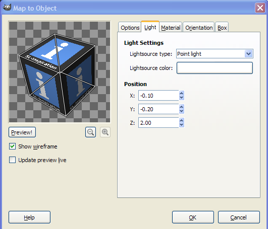
2/ The above window will open, and in the drop down list select Box. Also select Transparent Background so we can add our own background to the finished cube. Next click on the Orientation tab.
3/ You will see there are sliders so you can place the cube at the angle you want. Experiment with these sliders to get the look that suits you.
You can also see from the image above there is a live update option so you can see what your cube will look like. However, with large image this can take a while to update. Using the wireframe mode is much quicker.
You can also see from the image above there is a live update option so you can see what your cube will look like. However, with large image this can take a while to update. Using the wireframe mode is much quicker.

4/ After adjusting the rotaion of the cube there is another tab that allows you to adjust the lighting. Again experimentation is the best way to find what you like.
5/ When you are ready click OK and Gimp will create your cube with your icon or logo on each face.
Your cubed icon is complete, although there are further steps you can take to improve its appearance, such as adding a shadow and a background.
Before continuing with the following steps, autocrop the cube layer and export it. Now open a new window in Gimp that is larger than the cube icon image, (you may want to scale the cube image to make it smaller if necessary).
Adding A Shadow
1/ Add the cubed icon image to the new window with File > Open as Layer. Now create a new layer that is transparent and place it below the cube layer.
2/ Using the Paths tool, draw an outline of the cube, clicking with your mouse at each corner to change direction. Hide the cube layer and make the transparent layer the active layer.
4/ When you have finished select the Edit radial button below the tools icons, and then select Selection from Path. Using the Bucket Fill tool, fill the shape you have created with black. Your finished layer should look something like the image above.
5/ From the Toolbox, select the Perspective tool. By placing your cursor over the corners of the grid and holding down the left mouse button you will be bale to deform the shape you created until it looks like a shadow for the cube. The shape can be repositioned by dragging the central circle on the grid.
This stage may take a little trial and error, and you can of course use the Undo option if you need to. When you are ready click Transform in the small window (pictured above).
6/ Next go to Filters > Blur > Gaussian Blur and select a blur that suits your image. something like 25 may be a good starting point. Experiment with the Opacity slider at the top of the Layers panel until the layer looks like the kind of shadow you want.
You can of course save your cubed icon as it is, but next we are going to soften the corners on the cube here
Rounding Off the Cube's Corners And Edges
1/ First create another transparent layer and place it above the cube layer.
2/ With the Color Picker tool select the color of the lower right face of the cube (or whatever lower face that has the lightest tone).
3/ Now make sure the new layer is the active layer, and select the Brush tool. Choose a brush size that will suit your image. A little trial and error may be needed, although one with a blurred edge is most useful.
4/ Place the cursor at the bottom corner of the cube and holding down shift drage the cursor up to the top corner of this cube edge.
5/ Repeat this for the top interior edges of the cube but use the Color Picker tool to select the lighter tone of the upper surface. Right click on this layer in the Layers Panel and Merge it with the cube layer.
6/ To round off the exterior corners, select the Eraser tool and gently
draw a curve on each corner. Zooming in on each corner makes this
easier to do, as well as selecting the right sized brush for your
particular image. This should also tidy up any messy bits created by smoothing the interior edges.
7/ When you have finished, go to Filters > Blur Gaussian Blur and choose a blur radius that will suit your image. Click OK and if necessary you can make this layer less opaque by using the slider at the top of the Layers panel.
Your cube should now have rounded corners and smooth edges. All that needs to be done now is to add a background. In the example here I used the Blend tool to create a gradient of the foreground and background colours by holding and dragging the cursor from the bottom to the top of a new layer, then placing it below the other layers.
Creating a cubed icon or logo using Gimp takes just a few steps, and from there each person can decide on whether to add rounded edges and a background. This tutorial has also introduced those quite new to gimpt to a number of uses for some of the tools in Gimp.


